CONTACT US
604 558 4443
info@rodrozen.com
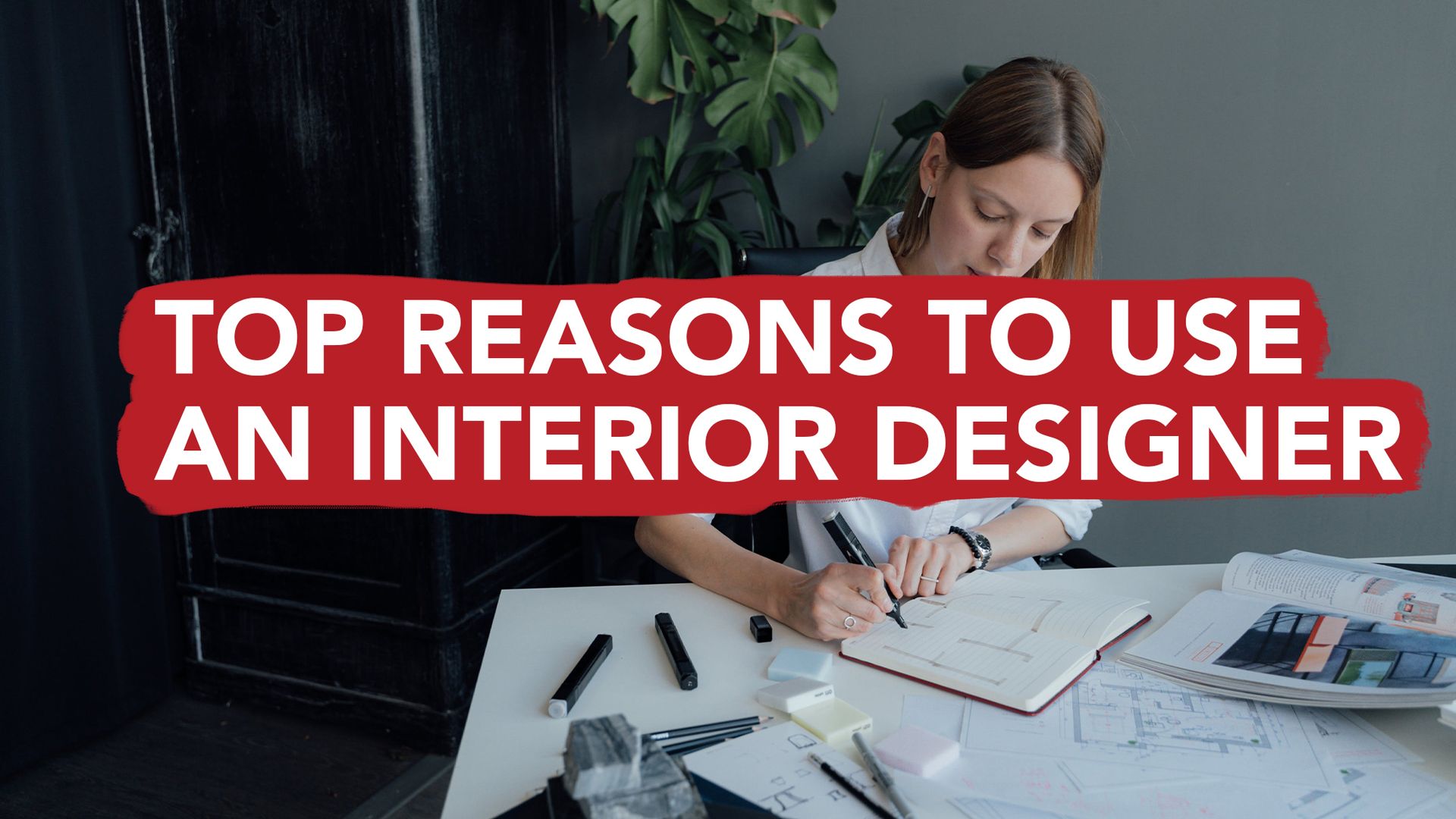
COLOUR THEORY IN INTERIOR DESIGN
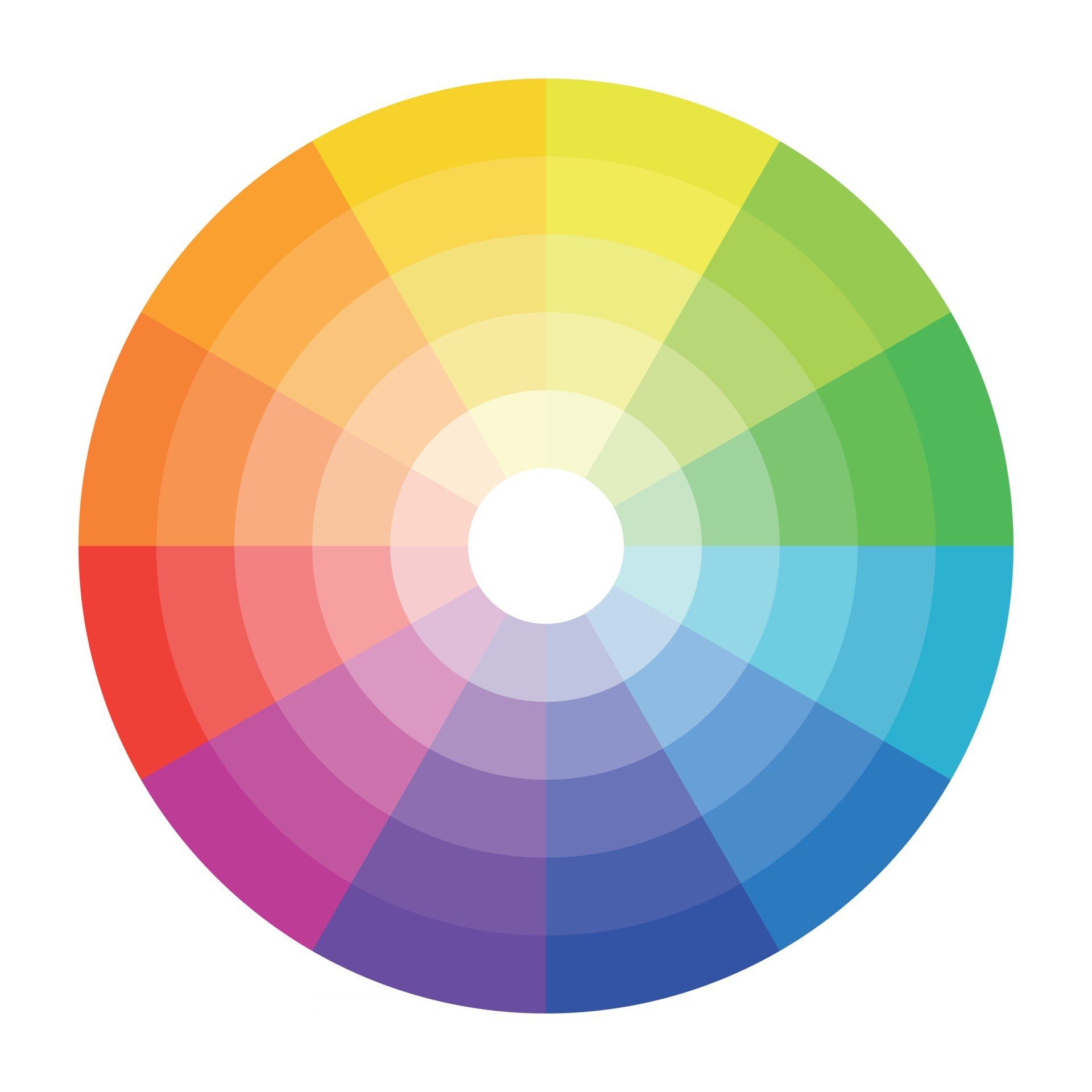
There are reasons why particular colour palettes are better in interior design. To help explain this, we use the colour wheel. A colour wheel displays every colour that we can design with.
We use the Red, Yellow and Blue (RYB) colour wheel in interior design as this displays every conceivable colour that can be created by mixing paints.
The RYB colour wheel consists of primary colours (red, yellow, blue), secondary colours (such as green, orange and purple) and tertiary colours (everything else). Typically the warm colours (yellows through to reds) sit on the right side of the wheel and cool colours on the left (green through to purple).
Every colour has a conscious and unconscious effect on us from a psychological perspective, we feel happy or energetic with certain colours, while we might feel angry and repressed with others.
It's essential to select an appropriate colour palette, luckily that is where an Interior Designer comes in! They have the experience of using colour in different ways to translate your ideas into your design and build.
You can also explore colour selections at home with an online colour wheel.
Here is an easy-to-use colour wheel that can help with design inspiration, you should experiment with different colour combinations.
Here we break down a few examples of colour palettes when it comes to interior design.
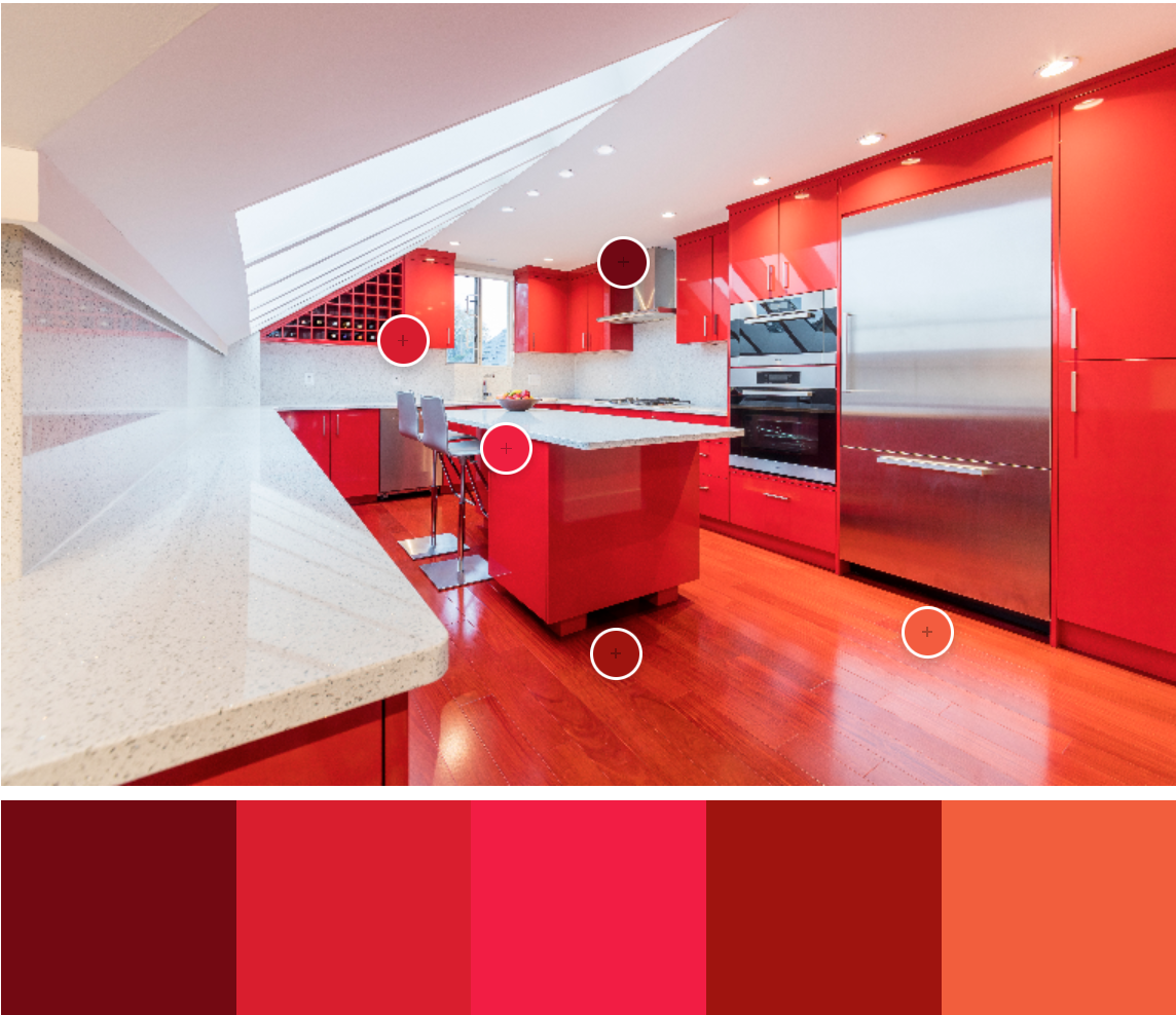
MONOCHROMATIC COLOUR PALETTES
Monochromatic colour palettes are one singular colour with all the different hues of that colour from lightest to darkest. If you love a particular colour or you want to keep things clean, but no less unique, this type of colour palette is best for you.
This kitchen design we built features the boldness of red and a few subtle hue variations of that red to produce this daring kitchen design. Don't be put off by this bold colour choice, you can also be sophisticated and understated with a monochromatic colour palette.
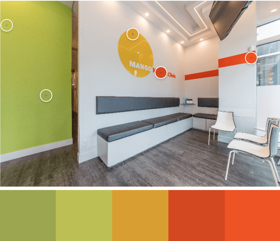
ANALOGOUS COLOUR PALETTES
Analogous colours is a palette style that pairs colours chosen close to your primary colour choice. Take orange, analogous colours to orange are red and yellow. This design of ours at Mango Medical Clinic features orange as a primary colour, with analogous colours of lime green and red.
Typically analogous colour schemes are best used by sticking to one side of the colour wheel, either the warm side or the cool side. As a general guide, you don't want to straddle colours that sit on either side of the colour wheel when working with this colour palette style. In this example we bent that rule and used green (cool) and reds (warm).
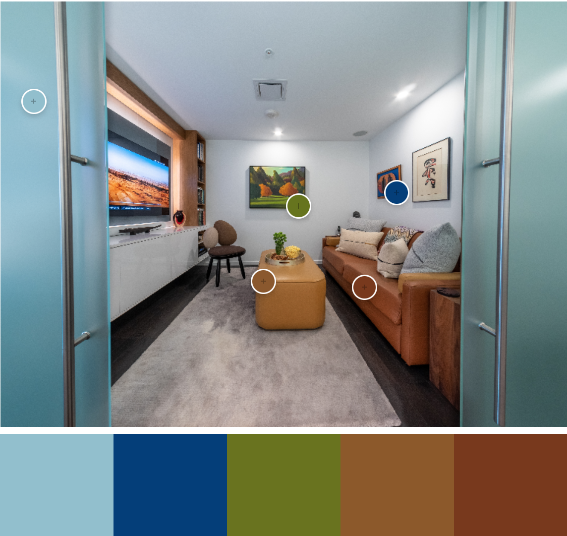
TRIADIC COLOUR PALETTES
Triadic colour palettes sit equally opposite each other in a triangular shape on the colour wheel. With triadic colours, we create three complementary colours to each other so they all match. All the colours are from opposite locations on the colour wheel in a triangle shape.
Typically the use of triadic colours results in contrasting and vibrant colour palettes. If you love getting creative with different colours, then a triadic colour pallet is an option for your design and build.
An example of this is a renovation we completed in early 2022. Orange is the primary colour, with complementary colours of blue and green.
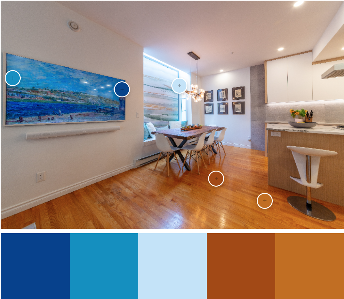
COMPLEMENTARY COLOUR PALETTES
Complementary colour pallets are two colours that sit opposite each other on the colour wheel. An example we see every day of complementary colours is blue and orange, which we see during sunrises and sunsets.
Complementary colours often produce contrasting and vibrant colour palettes adding a real sense of pop to a design.
You can see complementary colours in this townhouse renovation that we designed and built on West 13th Avenue in Vancouver. The use of oranges and browns against blues of three different hues.
RULE OF THIRDS
Like most things, you have to find a balance in colour. When you create a colour palette, the eye prefers to observe a balance in a ratio of 60% 30% and 10%.
Typically your primary colour is used predominantly on a feature wall, your secondary colour is used in a sofa design, and a tertiary colour is in the pillows and throws.
The rule of thirds, like all rules, can be broken with the right approach.
CONCLUSION
There is so much to learn about colour and colour theory, we hope this is a good starting point if you are looking for inspiration. We plan to bring you more on this topic to help inspire you for your design and build. When you are ready,
feel free to contact us, we offer an obligation-free consultation to help you get started.